Do you ever wonder why your images look a bit different when you print them? Then it’s time to learn about RGB vs CMYK.
You can use them to get accurate tones when you switch from your computer screen to paper. So let’s see the differences between these two color models.

Why is Getting Familiar with RGB vs CMYK Crucial?
Colors may be everywhere. But they manifest in different ways.
Some objects emit light, while others reflect them. So it only makes sense that colors manifest differently on various materials… Don’t be surprised if a printed photo looks different from what you see on your computer screen.
We use color models to explain the behavior of light on different materials. The most common ones are RGB and CMYK.
- RGB: The term is short for red, green, and blue. This color model defines how light-emitting objects, such as lightbulbs, behave. It’s an additive model. This means that when you combine light sources with these specific colors, you end up with white.
- CMYK: It stands for cyan, magenta, yellow, and key (a.k.a. black). This model defines how different colors of paint or ink interact with each other. It’s a subtractive model. This means that when you combine ink with the tones we mentioned, you end up with black.
RGB and CMYK also appear as color profiles on our computers. The goal of using color profiles is to ensure that tones remain accurate as we print our digital files. It’s crucial that what you see on the screen matches what you see on the paper.
Most photo editing software, such as Photoshop, have CMYK and RGB color profiles. They are for digital and print work, respectively. You must know what medium you want to use to display your images. This way, you can use the best option to ensure accurate results.
RGB
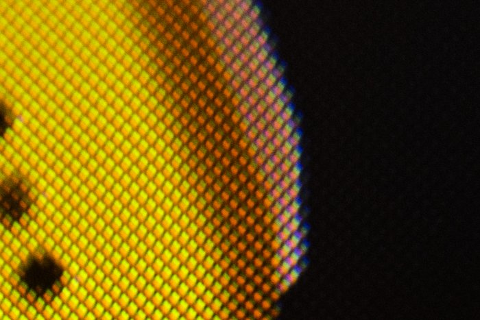
If you look at a digital screen, you find it consists of red, green, and blue dots. To display specific tones and hues, each dot varies its light output. This lets them achieve the color they need to create.
RGB dots light up brightly on your screen to create white. For black, they don’t light up at all.
Your screen uses certain combinations of red, green, and blue to display other colors. For instance, red and blue light up to create magenta. But green doesn’t.
All digital screens use RGB. But there’s a wide variety of display types that produce inconsistency in colors… from AMOLEDs to LCDs:
- AMOLED: These are like tiny light bulbs that emit light.
- LCD: These don’t produce light by themselves. So they need a white backlight to display color.
Both systems have pros and cons. For instance, AMOLEDs create more vivid tones. But LCDs are much more capable of displaying whites.
You can often find AMOLED technology on television and phone screens. Meanwhile, LCDs are more common in laptop displays and monitors like the Acer SB220Q.
In the image below, you can see a phone and a laptop displaying the same photo. The computer has an LCD screen. The phone has an AMOLED screen. As you can see, they both show colors slightly differently.

To ensure your screens display accurate colors, you need to calibrate them.
Buying a screen with 100 % sRGB coverage would also help greatly. In other words, it should be able to display the entire spectrum of colors possible with RGB.
And if you plan to print your work regularly, you need to get a high-gamut display, too. These are capable of properly displaying colors of images that will later go to print.
Read our article about the best monitors for photographers to learn more!
CMYK
People often use CMYK for print material. The ink colors cyan, magenta, yellow, and key (black) are used to create different colors.
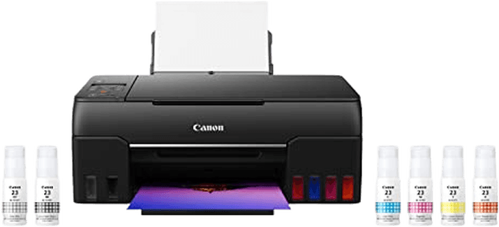
If you look at a printer, like the HP ENVY 6055, you see it uses CYMK ink cartridges. CMY (cyan, magenta, yellow) is often in one cartridge, and K (black) is in another.
In some ways, CMYK works much like RGB. It also uses specific combinations of primary colors to create thousands of tones. But since CMYK is used for prints, its process of creating colors is slightly different.
Theoretically, a combination of cyan, magenta, and yellow creates black. (This is like how a combination of RGB creates white.) But to save all that ink, it’s much better to use “key” (black) instead. And CMYK cannot produce white. So printers use the white on paper to display that specific color.

Displaying colors using CMYK is also different from RGB. Instead of using dots, it often lays one layer of ink on top of another to produce various tones.
But to create other colors, the same concept that RGB uses applies. For instance, a combination of cyan and magenta produces blue. Meanwhile, yellow and cyan make green.
Like RGB screens, various printing processes also vary in how they apply CMYK. Different options include offset printing to digital printing.
Photoshop sometimes includes CMYK profiles that apply to specific commercial printers… Are you working with professional print labs? If so, it’s best to ask the technicians what particular type of profile they use.
When Should You Use RGB or CMYK?
RGB is the default color profile for displaying digital images. So if you don’t plan to print your files, there’s no reason to switch to other options.
But you need to use CMYK if you want to publish your work. If you don’t, you end up with inaccurate colors.
How Do You Convert RGB to CMYK?
Are you working with a digital image? Its color profile is likely RGB by default.
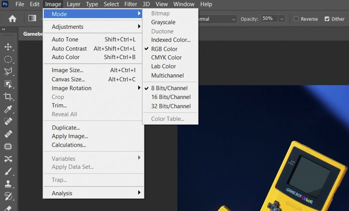
To confirm that your file uses RGB, go to Photoshop’s Image tab. Once the dropdown menu appears, go to Mode.
Then look at the checked profile. That’s how you know if your image uses either RGB or CMYK.
You already know that RGB is perfect for displaying images on screens. But what should you do if you need to print your image?
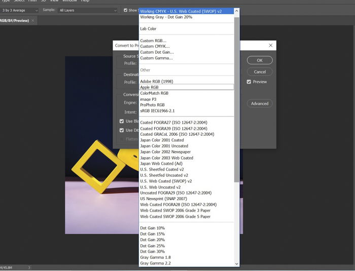
If that’s the case, then you’ll need to convert it. To convert your RGB file, go to Edit > Convert to Profile.
Now look for the Destination Space and click on that field.
As you can see, plenty of color profile options are available for you.
In most cases, choosing Working CMYK U.S. Web Coated (SWOP) v2 is the best default option. It works with regular office and home printers.
Are you working with a professional print lab? Again, asking them what type of CMYK profile they use would be best. That way, you can guarantee you get accurate colors.
Now, let’s check out the difference between RGB and CMYK. Here’s an image below using an RGB profile.
And here’s an image below using a CMYK profile.
The color variation may be so subtle you can barely see it. But CMYK looks a bit duller than the RGB version.
If you’re using your image for print, this is acceptable. But if you intend to publish it online, the small changes could affect the overall quality of your image.
Check out our post about color management to learn more about color profiles. (It includes the greyscale method for black and white photography!)
Conclusion
If you intend to print a lot of your work, you must pay attention to RGB and CMYK profiles. This way, you don’t end up with crazy tones when you publish your photos in a magazine.
But if you want to keep your work on your computer, there is no reason to convert your files to CMYK. RGB is the ideal profile for that purpose. And it’s the default setting for your images, anyway.
Even if you haven’t printed any of your work before, remember what you learned about RGB vs CMYK. You never know when you’ll need it. And your knowledge makes all the difference between a good print and a bad one.
Do you want great tips on how to edit your photos for stunning prints? Check out our course on Effortless Editing with Lightroom!
